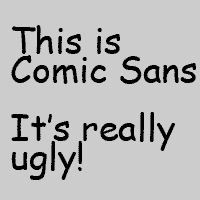
It recently occurred to me that Comic Sans is possibility one of the worst inventions of the late 20th century. I've never been a fan, and usually skip it when considering a font for anything I've needed processed in print. In fact, many times, I've been tempted to remove the font from my computer altogether, but I always relent, seemingly thinking that at some point I might need this goofy font for some reason. I'm finally ready to admit that I've been delusional on that front.
As the title of this blog suggests, this insult to adult humanity was created in 1994 by some douche named Vincent Connare. Before you track down his address and throw stones through his windows, it has to be noted that Connare isn't a TOTAL hack; he is also responsible for the quite respectable Trebuchet font. As awful as Comic Sans is, I can't entirely fault its creator. People create and attempt to market crazy shit every day, but it's up to discerning companies not to put into circulation a font that is so clearly clownshoes1, so damn you Microsoft for putting something so clearly ridiculous into circulation!
So...why am I picking on this harmless font when there are jackasses like Rand Paul and Newt Gingrich out there making grand ridiculous accusations and poisoning the minds of impressionable people of our country? I guess it's easier. And I had a girlfriend in college who changed all of the fonts on her computer to this disgusting display of text, and she was a nutjob...that should have been my first clue! Just look at it!
The blog almost writes itself, and it's the end of a REALLY long couple of weeks, so I decided to lob a softball rather than trying to throw some real heat. Honestly, though, there are groups out there who are dedicated to the pursuit of banning this pariah of the font world.
http://bancomicsans.com/main/
You can read more here!
1 See, Sara! You CAN use it in a sentence...Clownshoes: a definition
Subscribe to:
Post Comments (Atom)


7 comments:
Due to its irregular letter shapes/sizes, Comic Sans is the font most easily readable by dyslexics and others with print-based disabilities. So, despite its ugliness, I actually use it quite a lot.
Also, just because you *can* use "clownshoes in a sentence, it doesn't mean you *should*.
You know, you have this wonderful way of completely deflating the point I'm trying to make in a blog entry...and you're not doing it to be malicious, I know, but this blog thing is totally clownshoes...yeah, I said it.
Would it help if I said I wished the most LD-accessible font available to me wasn't so clownshoes?
yes. Yes, it would!
Hear! Hear! Comic Sans is stupid and ugly and should never be used by adults unless they work with kids, or unless they are wearing clownshoes. And in the latter instance, they should be doing so far, far away from me.
Ok...so, McSweeney's decided to weigh in on the matter...
http://www.mcsweeneys.net/links/monologues/15comicsans.html
There are so many t-shirt worthy phrases in that article that I don't even know where to start.
Wait, yes I do. I want a t-shirt that says "I am a sans serif Superman."
Post a Comment